

THE CHALLENGE
How do we make a law college look above the bar?
From Green Graduates to Alumni Abroad
By refreshing the content and design of Lewis & Clark current publications we brought new attention and interest in the law school, increase enrollment, demonstrate diversity, promote general law studies, and showcase practical skills building programs.

ALUMNI PUBLICATION
Connecting Alumni
We reimagined the Lewis & Clark Law School's alumni magazine to: build energy and engagement by alumni and friends, strengthen the Law School’s reputation and influence rankings, support admission and fundraising efforts and share school news in a polished and professional manner.

Advocating for community
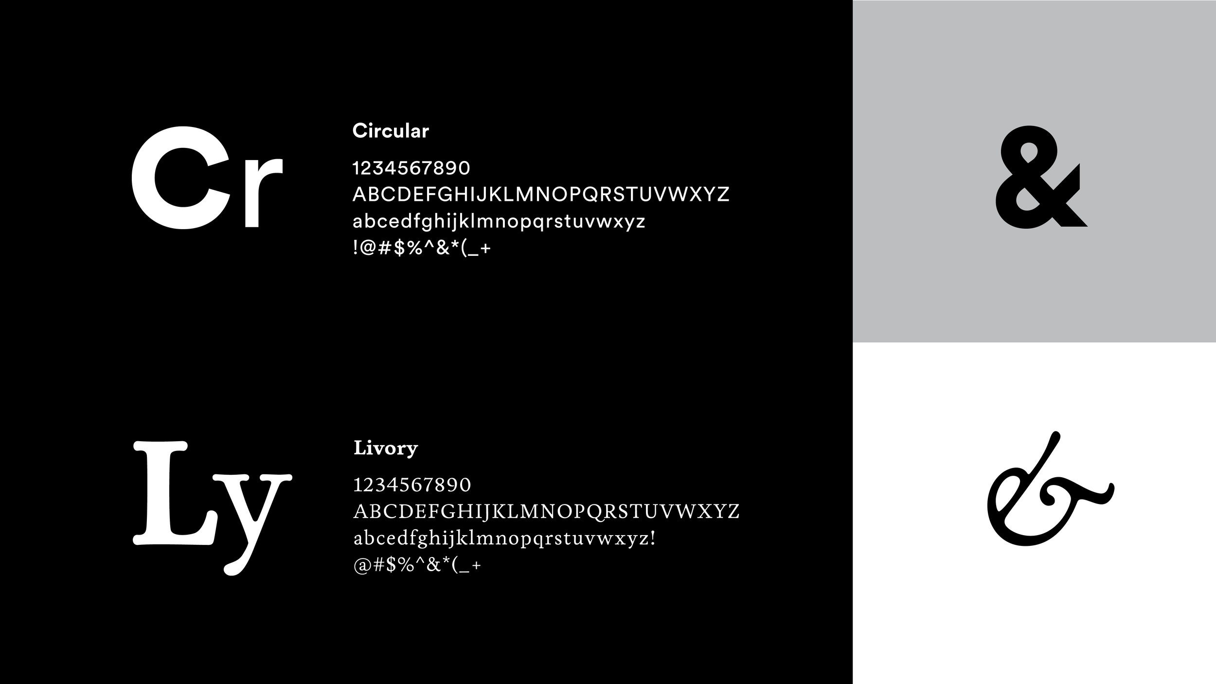
Our logo and layout exploration launched directly from the definition and concept of being an advocate. To publicly support or recommend a particular cause or policy. To advocate is a positive and uplifting expression. It’s about standing up and saying something. The new Advocate logo and magazine design express this mentality through subtle integration of an arrow.

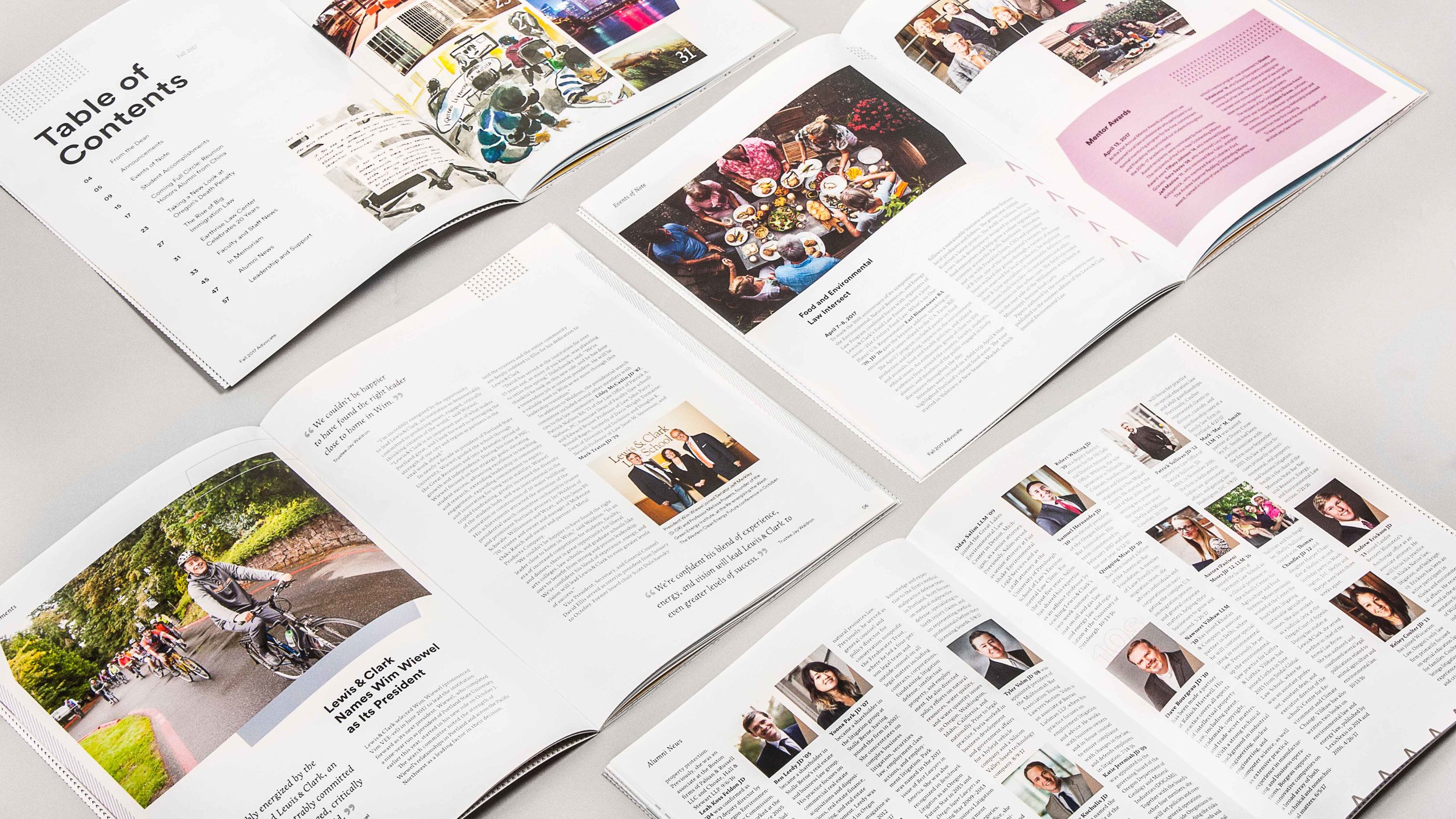

The reimagined magazine is clean, modern, and professional while showcasing the unique personality of this Northwest law school and has generated excitement among staff, alumni, and the academic community.


ADMISSIONS KIT
Learning Law in Lush Greenery
HUB audited and refresh key materials to create a thoughtful line of modern, premium publications, as well as a few new pieces. Our approach stemmed from the concept of rigorous balance, a yin and yang creating a balanced and editorial look-and-feel. This theme shares photo-heavy spreads balancing with more traditional text-heavy editorial-style text pages. Updated sizes and shapes of pieces strengthened the feel along with graphic headlines and full floods of color balanced with strong images and framing. The design celebrates interactions and relationships with genuine emotion and embraces real conversations, caught in a curated, but honest way.
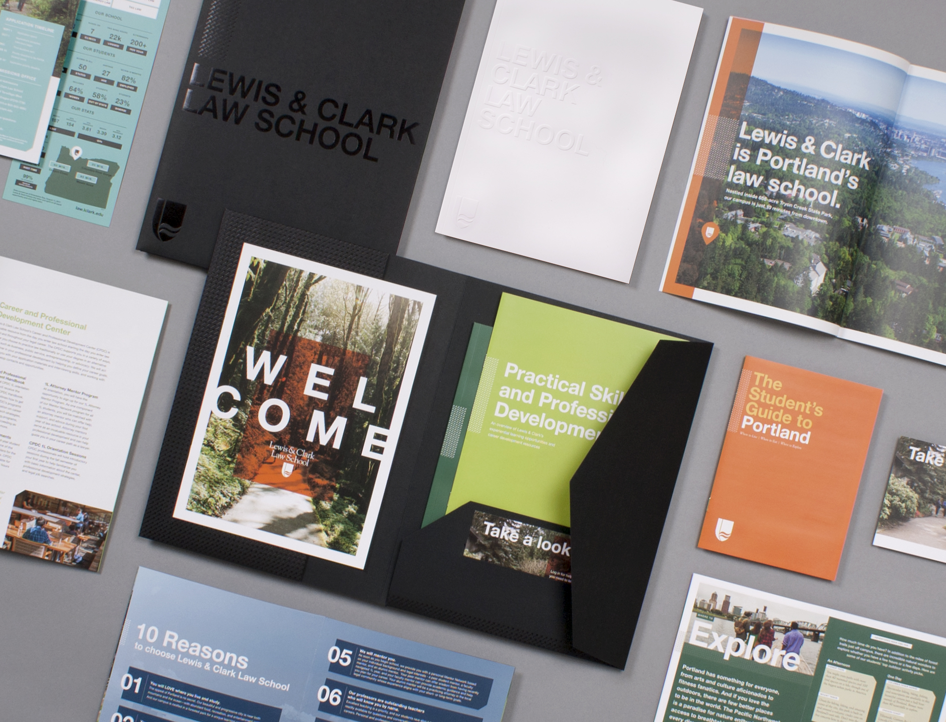
Going Beyond the Book
Attention is paid to the angle of photos, movement, and especially to the genuine emotional quality and interactions with each other. The Lewis and Clark difference is about the real relationships and support the cohort and professors provide each other. We wanted to capture that as our first priority. Showcasing the beauty of the environment and building as a supplement.


We evolved the brand to create a fresh, evergreen design that balances the rigorous and serious nature of law school with the inviting feel of students and staff. The suite showed cohesion but not uniformity between all Law School pieces so they family together while introducing unique elements of surprise and intentional cadence and pacing of content.
Inspired by the Pacific Northwest
By developing a tactile experience through use of materials and production methods we increased memorability all while respecting the L&C brand. The resulting suite includes a view book, program brochure, practical skills/professional development brochure, welcome/admit packet, calendar and profile card.

DETAILS
Designed in Partnership with Lewis & Clark Law School
Brand Strategy, Communications, Marketing, Design