DESIGN HISTORY SPOTLIGHT: Pantone and the Color of the Year
Seldom can designers be brought together to agree on a single design moment or trend. In an industry that demands creativity and originality, big and loud personalities often make themselves heard through opposition and dissent—decrying the latest rebrand of a beloved consumer product, nitpicking the typographic flaws of a letterform, acting like they’re too classy for the newest weird web design trend, or too cool for a simple and effectively straightforward packaging design job. But every year, Pantone does the near-impossible: distill the past year into an agreed-upon visual checkpoint of a single color. Essentially, a state of the union address communicated visually for those in creative fields of all kinds.
For those living under a colorless design-free rock, Pantone started in 1950’s New Jersey and is the premier producer of spot color inks in the print industry across all sectors. Chances are, everything you’ve ever seen printed with a beautiful, vibrant high quality color has used a PMS color, which stands for Pantone Matching System. Monopoly much? Maybe. But if a picture is worth a thousand words, how many is a single color worth? Are words even an accurate measure?

To Pantone, the color of the year is a visual response to, and/or a reflection of the cultural zeitgeist at a moment in time—design or otherwise. When reflecting on the Color of the Year for the last 22 years, the first 10 or so fell a little more squarely within the scope of design and visual industries, albeit with tinges of cultural commentary. The first ever chosen, 2000’s Cerulean (15-4020 TCX), reflected not only a calm optimism for the new millennium, but prophesied a certain Britney and Justin matching denim moment in the subsequent year. Contrast that optimism with 2020’s Classic Blue (19-4052), a hue chosen for its “thought-provoking” and “reassuring qualities” that “highlight our desire for a dependable and stable foundation on which to build as we cross the threshold into a new era.” 2021 gave us a joint pairing of colors, Illuminating (13-0647) and Ultimate Grey (17-5104) that contrasted a renewed sense of optimism with a deeper reflection on nearly 2 straight years of an uncertain and chaotic pandemic reality. The joint color pairings give us the truest sense of what Pantone seeks to do with their Color of the Year, which is to simultaneously reflect our current reality back at us, while responding with new interpretation of how to proceed. With color alone, Pantone achieves something deceptively simple, yet shockingly difficult in any visual field: communicating a fleeting feeling with a nonverbal medium.
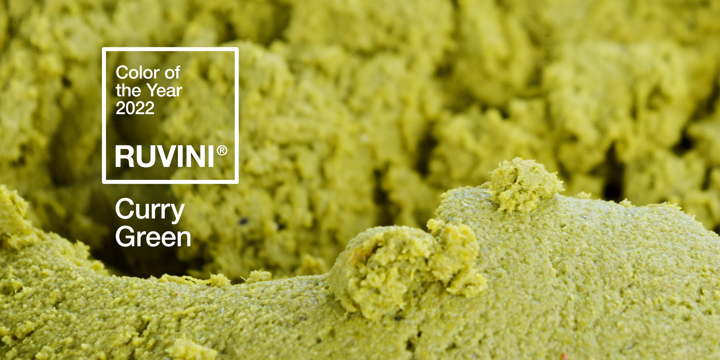
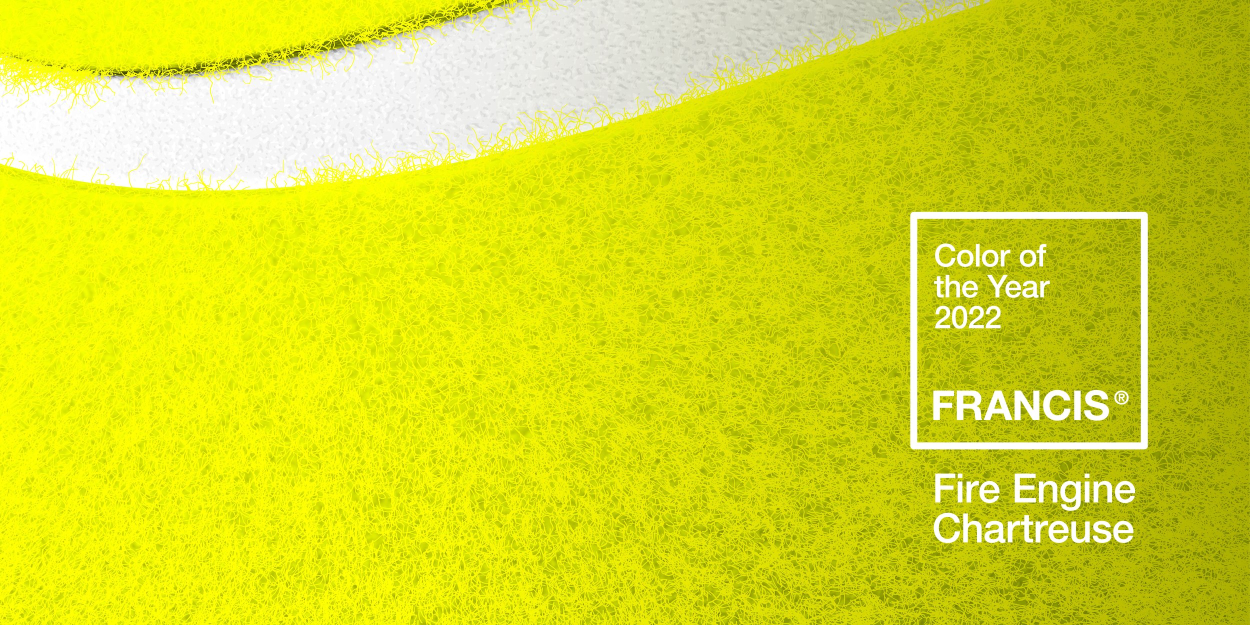
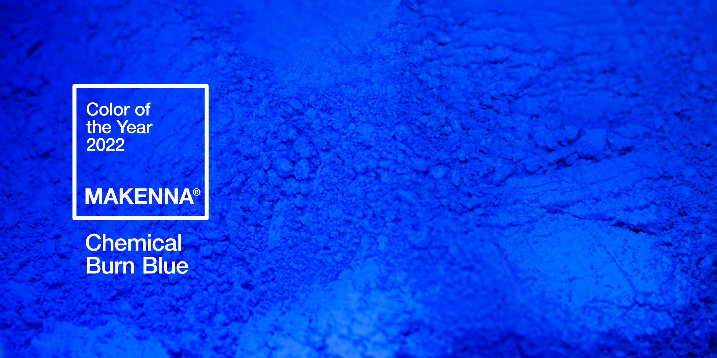
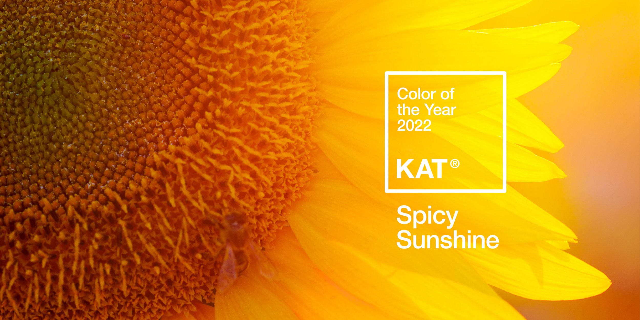
As a post-pandemic reality draws ever nearer, Pantone’s 2023 Color of the Year, Viva Magenta (18-750) is described as “an unconventional shade for an unconventional time.” While HUB reflects on the end of the previous year and the beginning of a new one, we decided to ask some of our teammates what their color of the year selections would be! Swipe through to see some of our choices.