
DESIGN HISTORY SPOTLIGHT: Susan Kare and the First Apple Macintosh GUI
My more seasoned coworkers would probably groan if I told them I wished things were harder to design and modern-day computers weren’t so smart, but for me, limitations breathe new life into stagnant creativity. I often wish I was constrained to a tiny pixel grid, where the most basic essence of your message must be communicated with clarity and economy of space. One could argue that all graphic design boils down to some form of visual communication, and no designer has threaded the needle between clarity of message and creativity within limitation quite like Susan Kare.
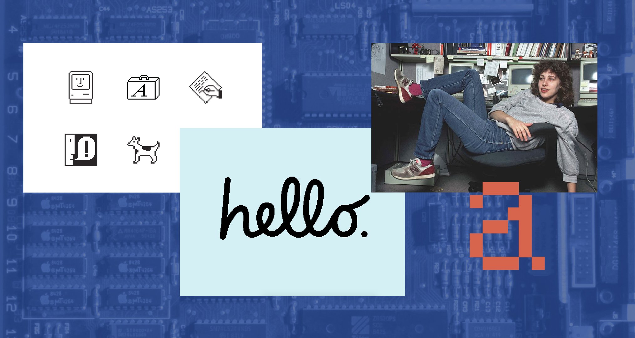
Kare is an American artist and graphic designer, who leveraged her fine arts experience in needlepoint and mosaics when Apple commissioned her in 1982 to sketch out some icon ideas and type explorations for its upcoming Macintosh 128k Personal Computer. Using a graph paper notebook, she worked within a 32x32 pixel grid as she ideated simple, yet memorable visual representations of software commands and applications. As an outsider to the heavily specialized programming industry, she infused a sense of whimsy and humor into the groundbreaking Macintosh GUI, in a style that Apple would go on to reference in nearly every device released from that point on. In just one year, she single-handedly developed the Macintosh’s core visual design language, as she worked closely with programmers who would develop and refine computer drawing programs alongside Kare while she used them.
You have to understand that at this time, computers mostly operated off DOS and command lines, with zero user interface to speak of. Apple revolutionized personal computing when they introduced an intuitive and humanized visual counterpart to the complicated software tasks that were happening behind the scenes within these machines. The way we use and interact with computers today is a direct result of Susan Kare’s visual intelligence and creative work with Apple. To say it’s fucking cool would be an understatement.
What I love about Kare’s work is her ability to communicate high level concepts through a simple and easy to understand visual vocabulary, a lexicon that transcends language and time. It’s clear that the constraints she had to work within catalyzed her creativity, given the whimsical and unserious nature of her icons. And as a fan of design that doesn’t take itself too seriously, when given the chance to inject joy into something as dense and inaccessible as computing was in the 80’s, you take it.
Nowadays we talk ad nauseum about “disruption” in the tech industry, but so much of what we see now pales in comparison to the seismic shift this work initiated, whose aftershocks we still feel every day. Stories like these inspire me to no end, seeing designers use their abilities like aesthetic alchemists, wielding art like a mystical reagent that can humanize cold, metallic hardware. It’s a legacy and a lineage that makes me proud of my profession, and a testament to the profound impact even the simplest images can have on culture.

Kare, speaking to Cosmopolitan about her Macintosh work: “I love to derive inspiration from all types of images: mosaics, hieroglyphics, petroglyphs, woven patterns in textiles, and needlework. There is a lot of very good "pixel" design work before the 20th century… I don't use work from the past as a literal guide; rather, those artifacts reinforce a view that simple images can communicate with wide audiences over time. Icon design is like solving a puzzle, trying to marry an image and idea that, ideally, will be easy for people to understand and remember.”
: n )